NHS digital - Cervical Cancer Screening
The problem
Safely and securely replace a 30 year old system
My role in the project
I was part of the screening programme for 2 years, starting as the sole designer and then being part of a much larger team including mentoring graduates. I was the lead designer on adding test results and the prioritisation list that is sent to doctors surgeries.
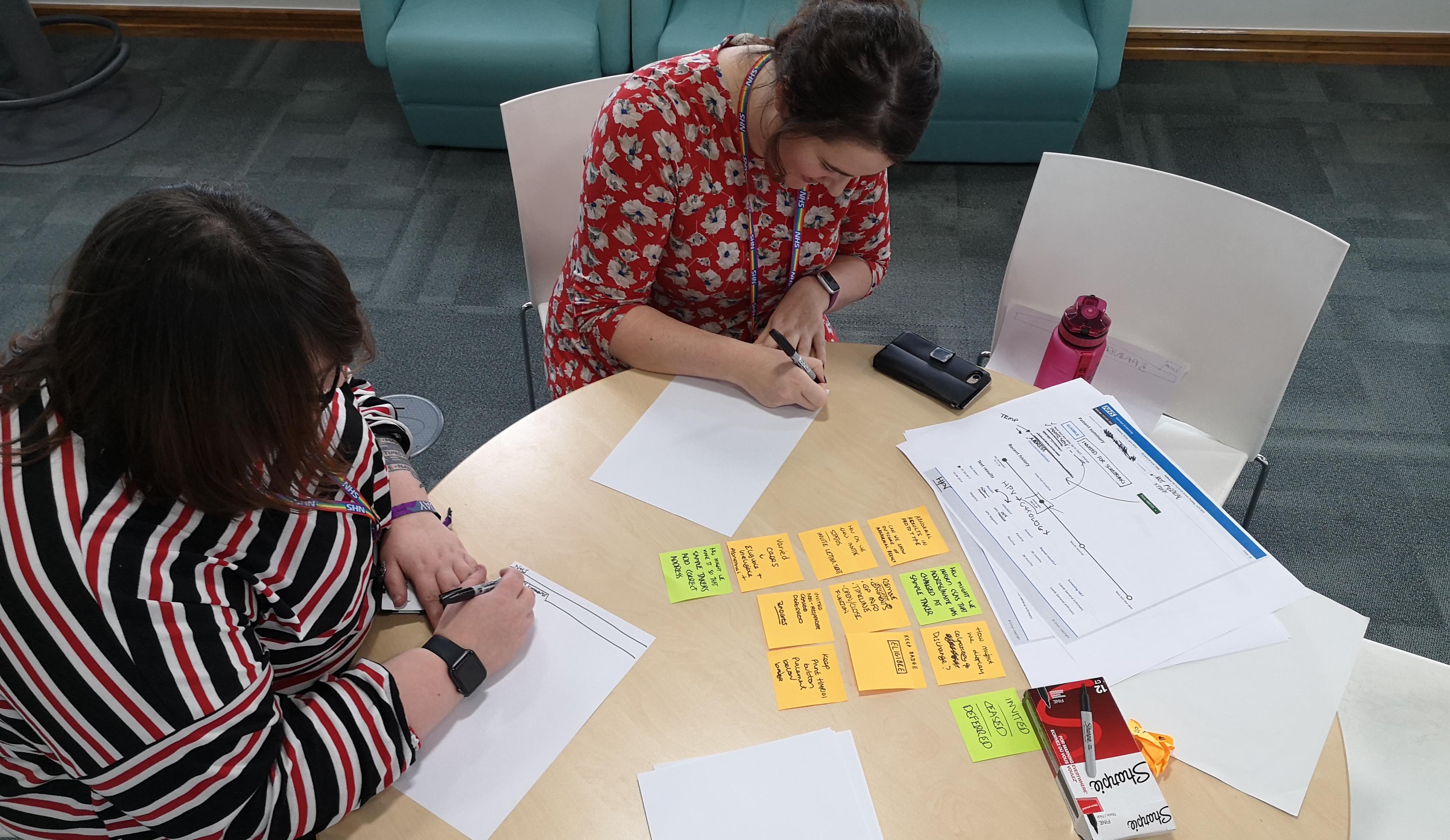
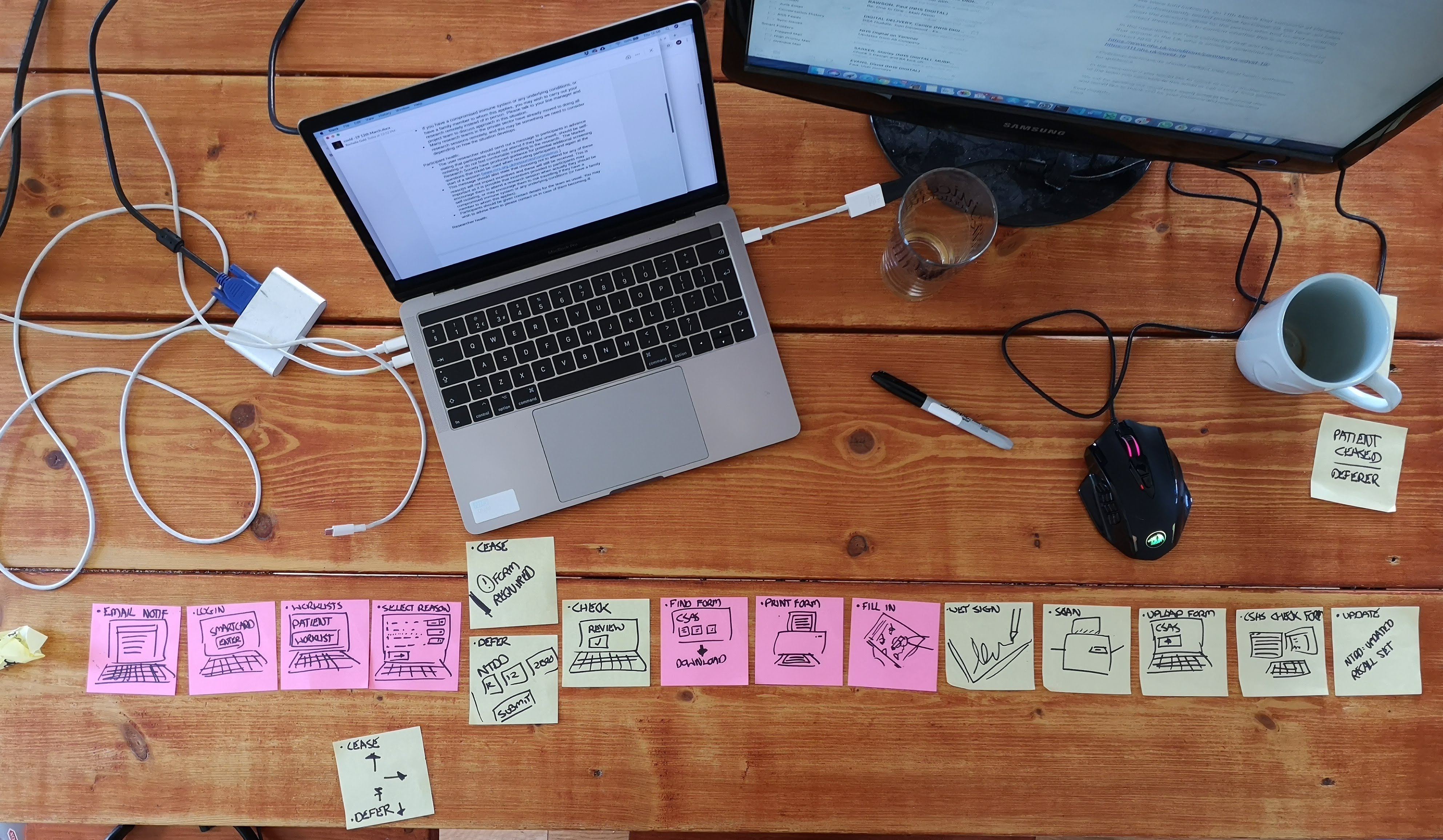
Understanding the as is
Screening is a large and complex process that can be boiled down to:
- a person is identified as being eligible for screening and this is checked with their doctor
- the person is sent a letter to book an appointment to visit their doctor
- during the appointment a sample is taken and sent for testing
- labs will check the sample and recommend whether further information is needed
- the person will get their results process will start again
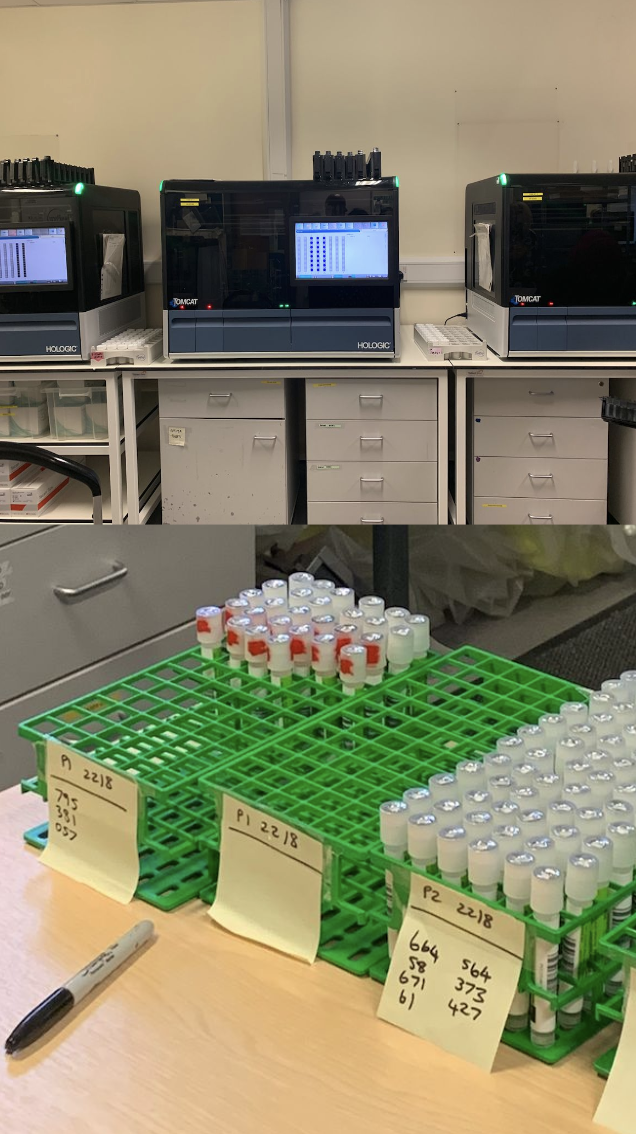
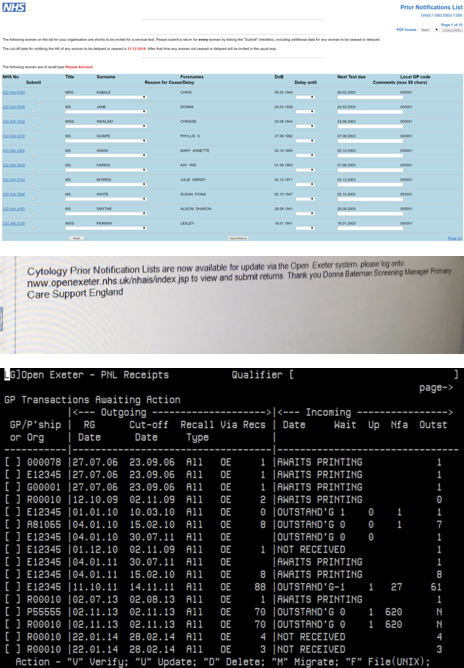
before we even started sketching and prototying it was essential that we understood how the current process works, what are the pain points and where can we add the most value.
Viewing the patients information
The first problem we tackled was that there were 2 different front ends depending on the user. Admin staff were using a black and white terminal and the doctors surgeries were using a web front end that had some clear issues. We also found that getting all the information required several screens, clicks and also the historical knowledge of using the systems.
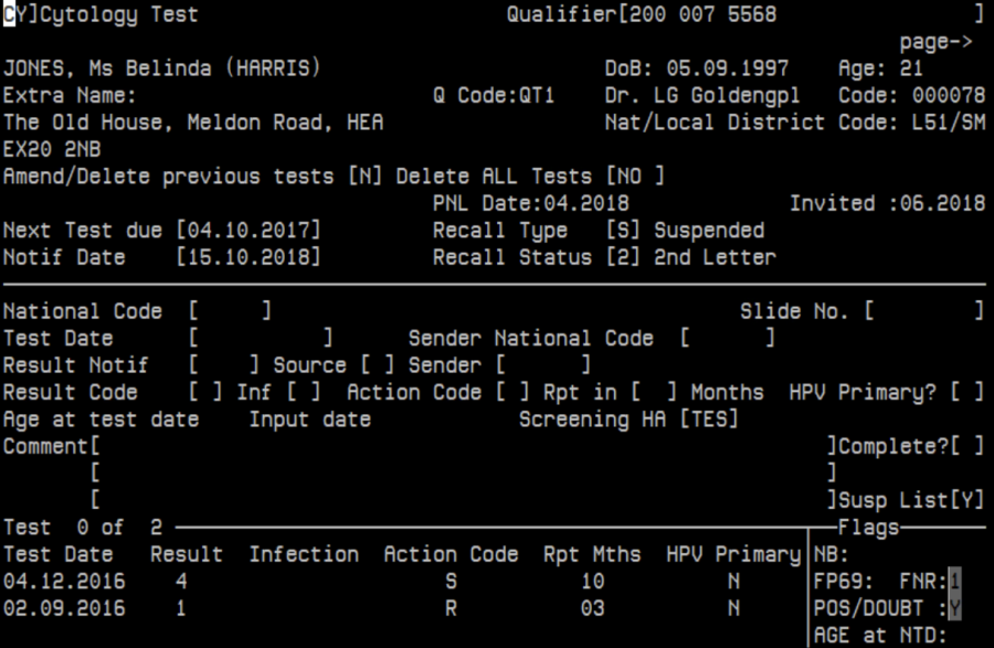
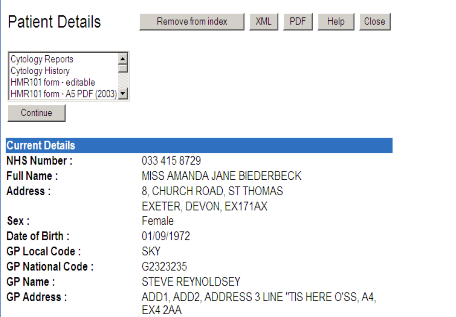
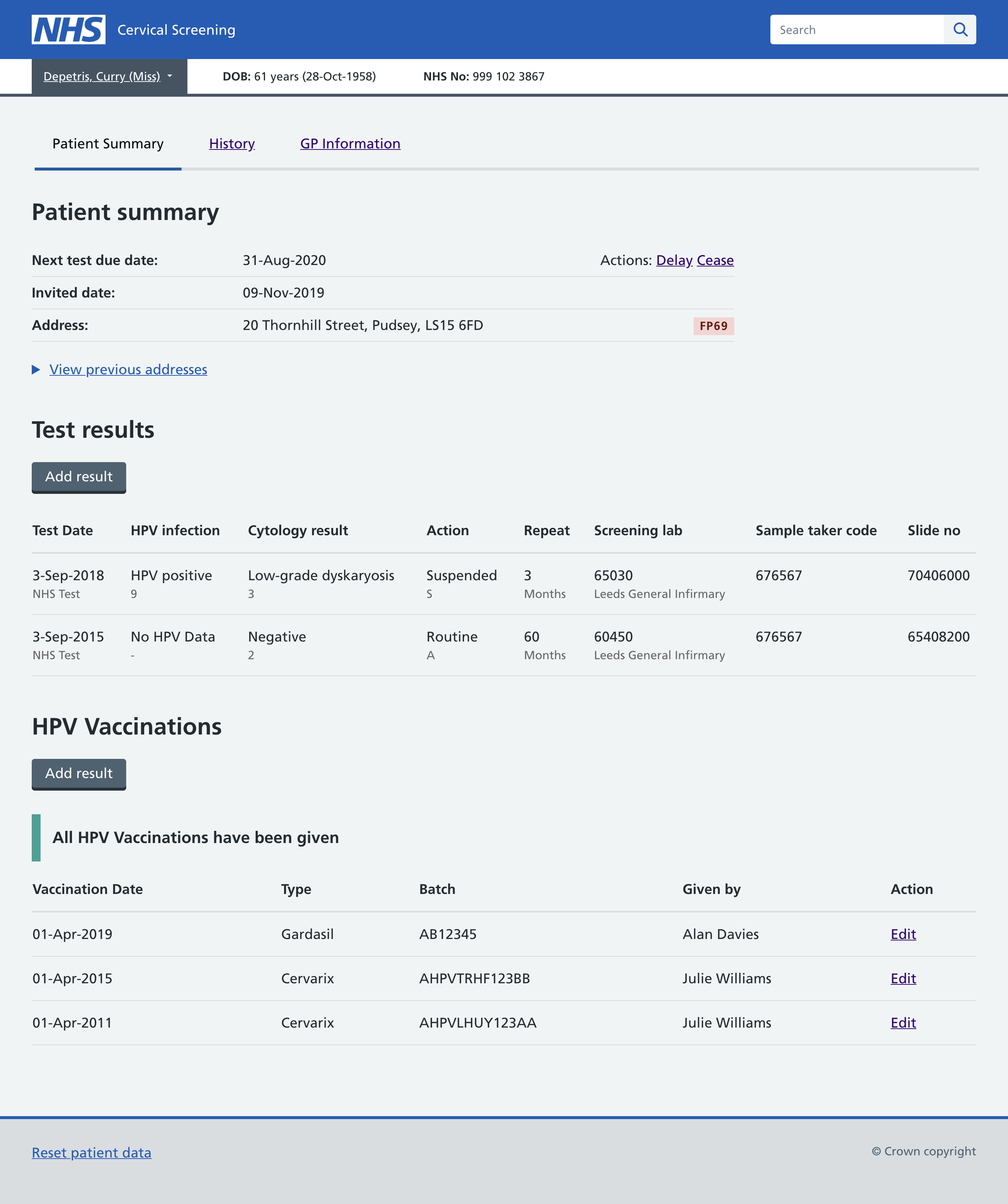
We co-designed a new screen with our admin users over a few sessions. We needed to understand what was important to them and made one screen that pulled in all the relevant information such as next test due date, recent results and the current screening status. We tested the new designs with admin members who were not part of the co-design process as well as taking the prototypes to doctors surgeries.
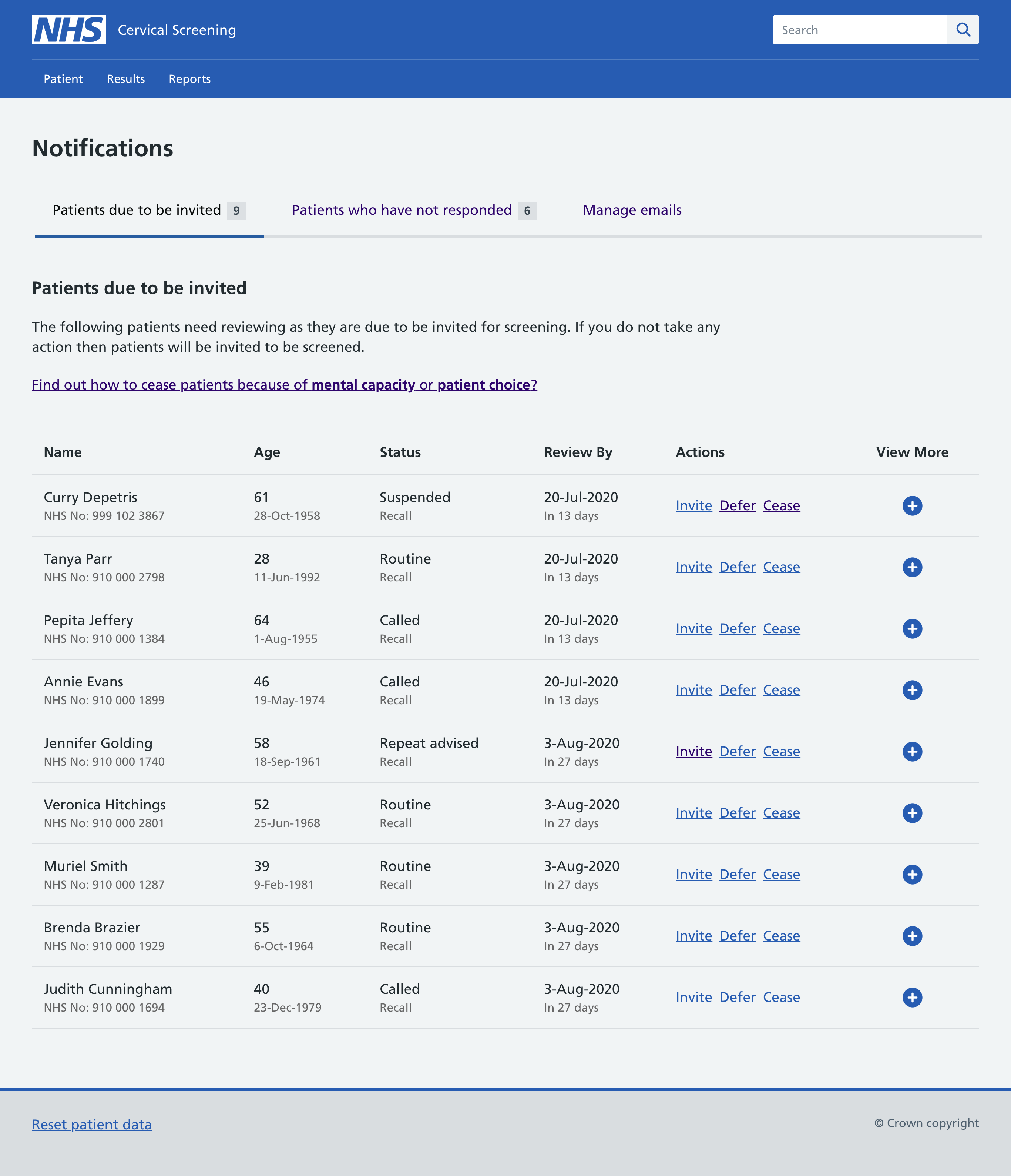
Managing the list of eligible people
The list of people ready to be invited was called the PNL (Priority nofitication list), this was a list viewed but the doctors surgery so that people who did not need to be screened could be removed from the invite. This can be for many reasons but if someone is going through cancer treatment then asking them to be screen could cause potential distress. We again looked at bringing information from multiple places under one screen as well as making the actions a lot clearer and easier. We had requests to add filtering and sorting on columns but we successfully pushed back because there is an order that these people should be displayed, and an order that they should be processed. We wanted to make sure that no one was missed and that high priority people were at the top of the list.
We also knew that doctors were looking at the age of the people on the list so rather than forcing someone to calculate the age of a person from their date of birth we did that for them. There was push back to use the date of birth and from further digging we understood that date of birth was useful as a piece of identity when confirming the person.
